Purchased by interior designer Laure Chouraqui, this 1970s apartment was redesigned to restore a sense of overall cohesion and better showcase its natural light. The checkerboard-patterned hardwood floors, characteristic of that era, were reinstalled in every room to unify the spaces. The renovation emphasizes simple solutions, affordable materials, and vintage finds, in an understated style that allows the objects and furniture to take center stage.
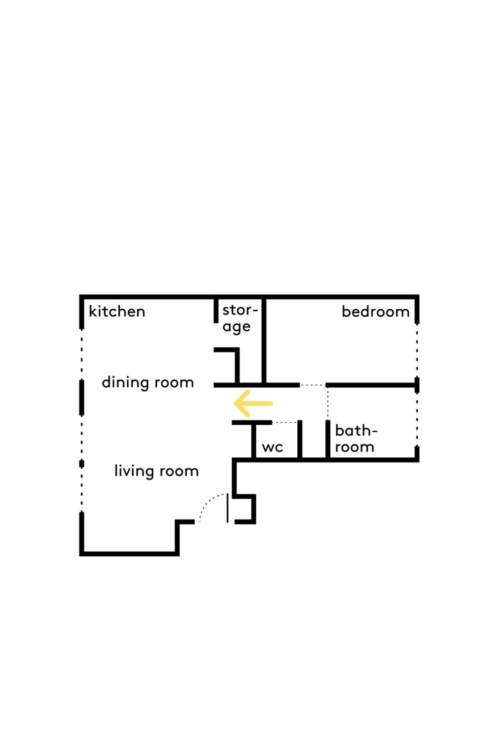
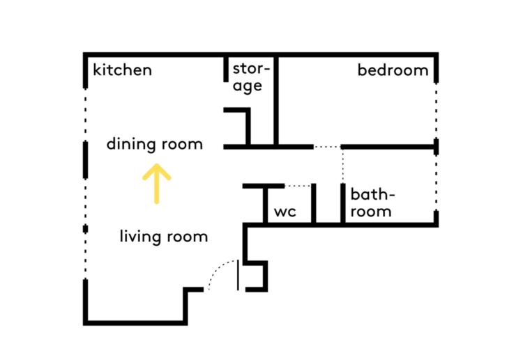
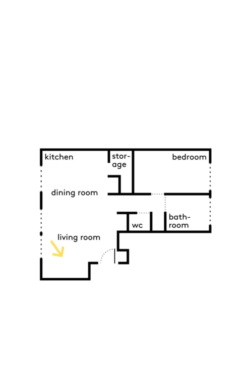
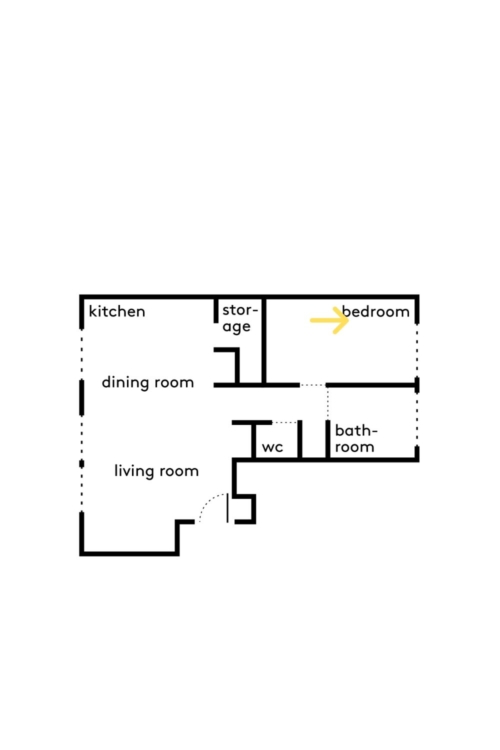
The dual-aspect apartment is particularly bright—a feature that Laure Chouraqui wanted to preserve by redesigning the layout without adding more partitions.
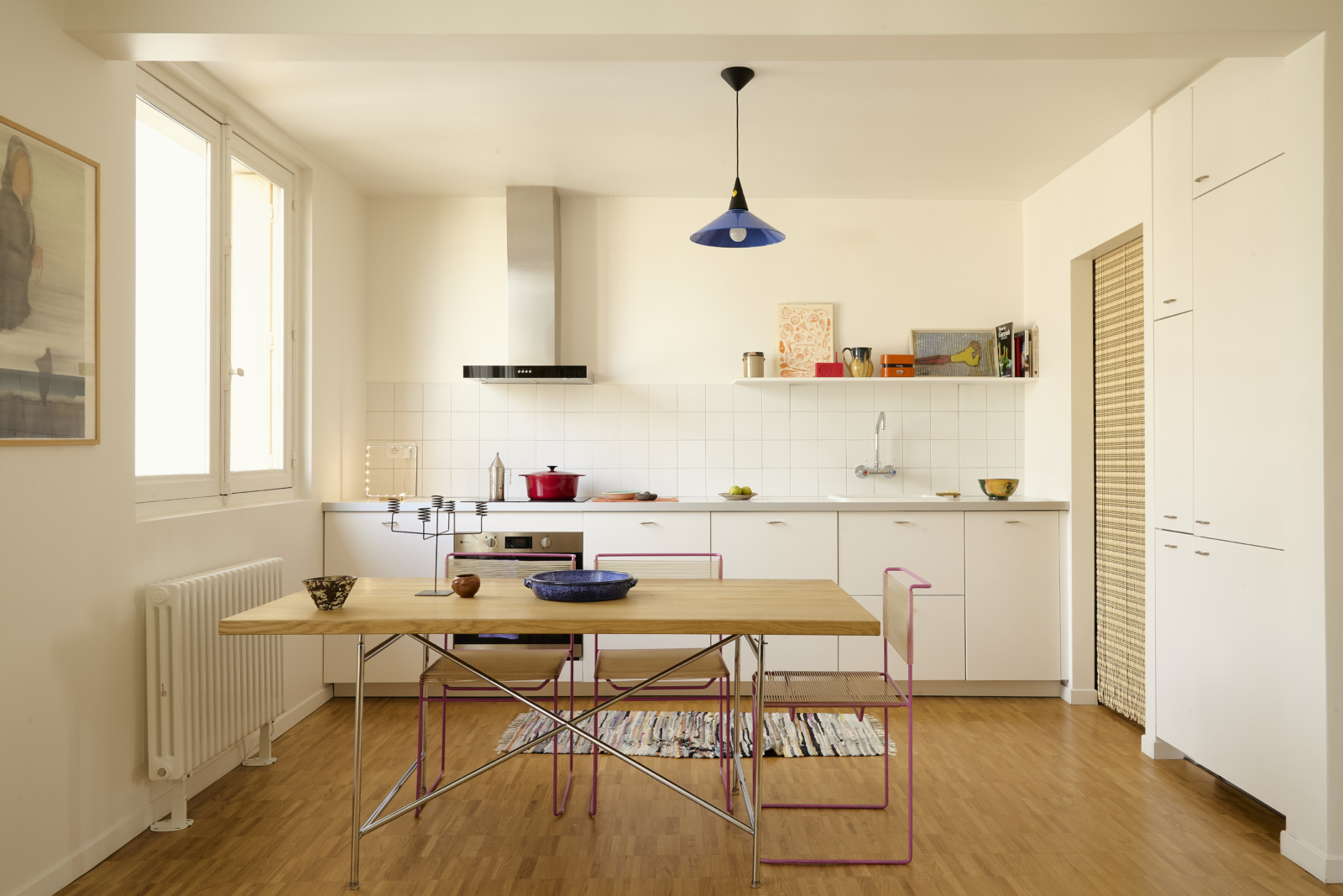
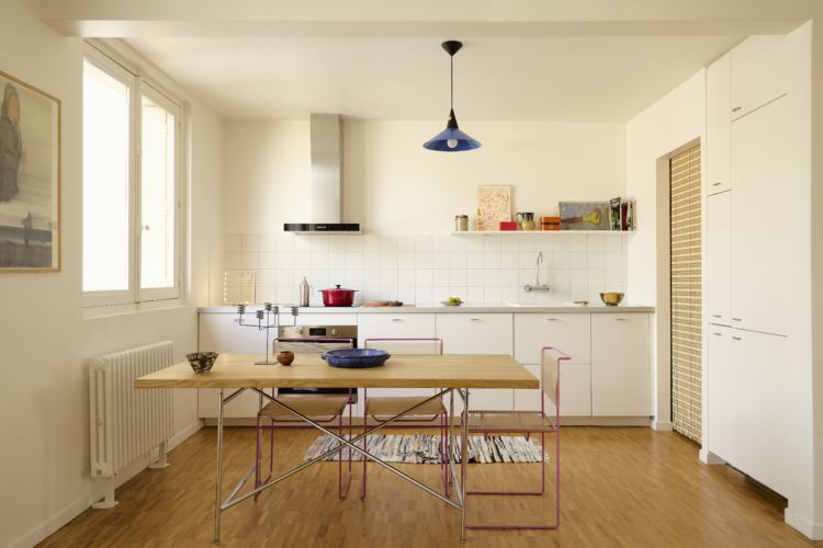
Located in the former living room, the kitchen now flows seamlessly into the living area and is arranged around the dining table. The off-white IKEA cabinet fronts take a back seat to a very understated design, accented by Giandomenico Belotti’s Spaghetti Chairs. To the side, a bead curtain marks the entrance to the back of the kitchen and adds a playful touch to this deliberately minimalist space.
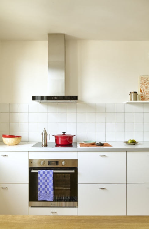
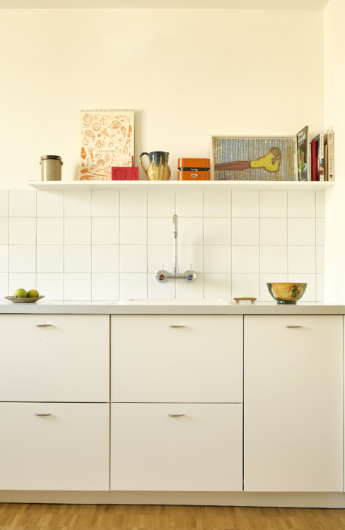
The kitchen is built on an IKEA base with off-white cabinet doors, customized with metal handles found at Rotor DC. The countertop was made using the same 20 x 20-centimeter white tiles as those used in the bathroom. This cost-effective choice creates a sense of continuity between the two spaces while giving the kitchen a more distinctive look.
Just a few details are enough to add character to a very understated design. The kitchen faucet, found on Leboncoin, is mounted directly on the wall and almost becomes a decorative piece. This attention to functional elements—chosen for their personality rather than their value alone—contributes to the apartment’s strong identity.
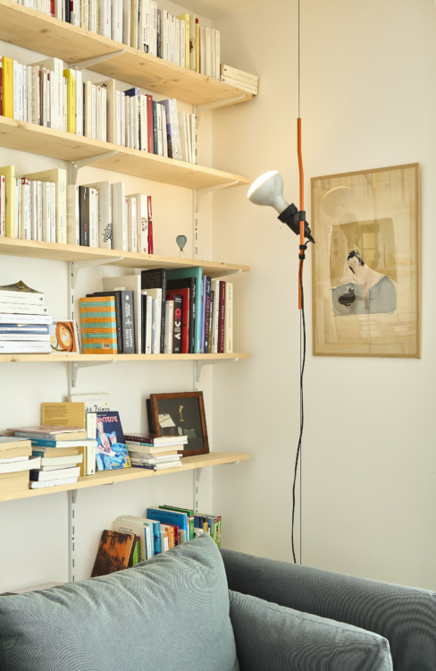
In the living room, the bookshelf was built using a system of adjustable white metal rails and simple wooden boards. This solution is both economical and adaptable, allowing for a large collection of books without making the space feel cluttered. Parentesi lamp.
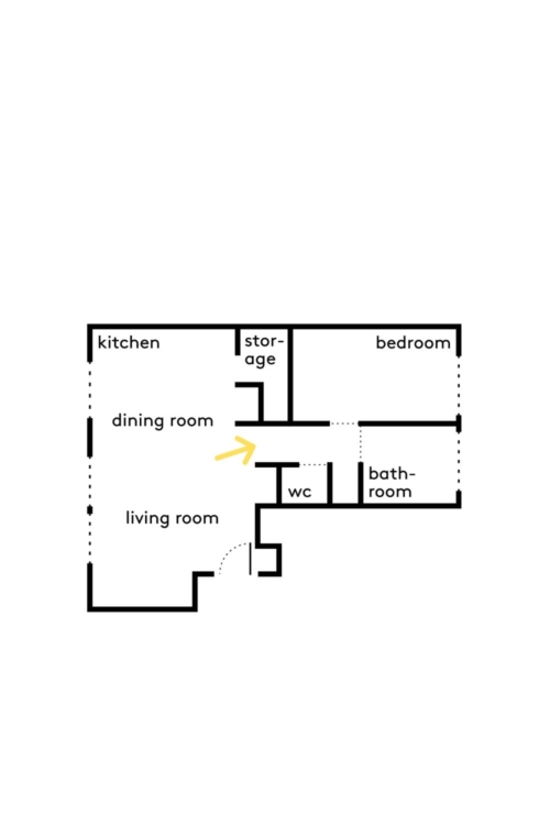
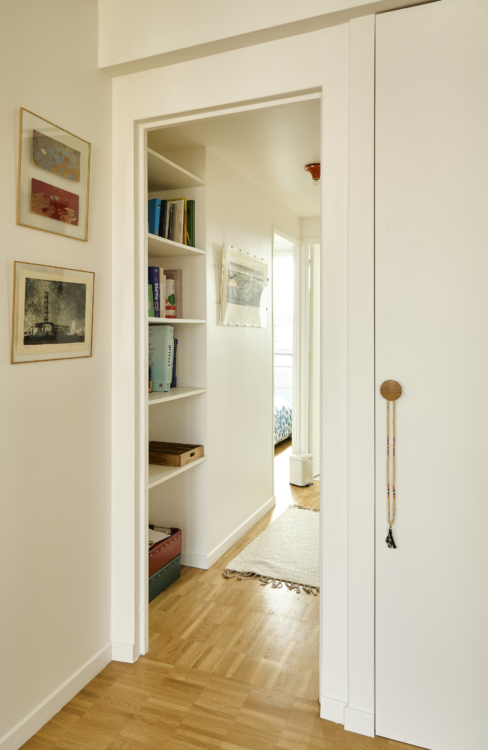
In the hallway, an existing recess was converted into storage space by installing open shelving. This pragmatic approach is characteristic of this renovation, which was planned with a careful budget.
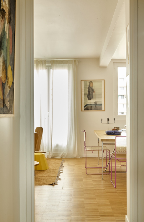
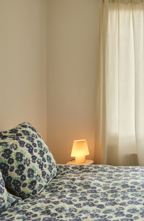
The room has a deliberately soft and minimalist feel. The light-colored walls, sheer curtains, and understated furniture create a calm environment where natural light takes center stage.
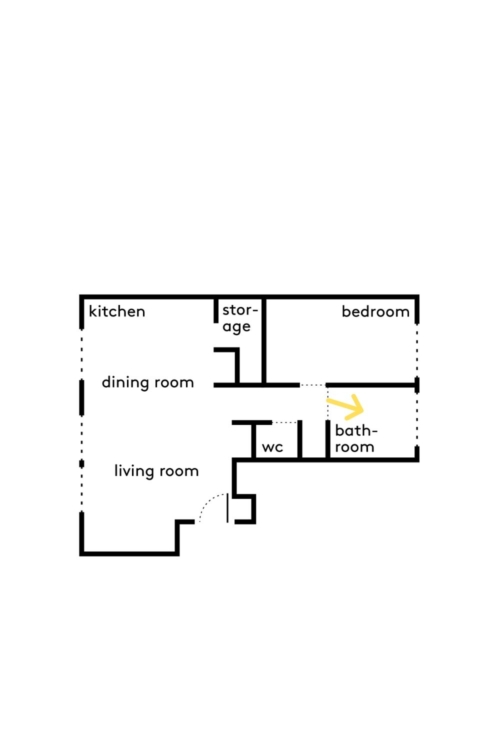
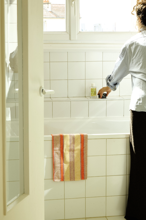
The bathroom, which was formerly located in what is now the back of the kitchen—a space with no natural light—has been moved into the former kitchen. The bathtub sits beneath the window, with a slight overhang that provides a convenient ledge for placing everyday items. White tiles, chosen from Cesi’s most affordable options, cover the walls in a deliberately simple and timeless style. The glass door from the kitchen was preserved and reused to allow light to flow all the way into the hallway.
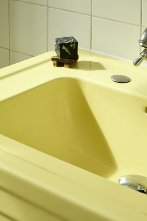
In this all-white space, the butter-yellow freestanding sink adds a touch of originality. Found on Leboncoin, this vintage piece helps avoid the overly uniform or “sterile” look of an all-white bathroom. This is a prime example of Laure Chouraqui’s approach: combining simple elements—sometimes secondhand—to create a truly personal atmosphere.